Building an information dashboard to display air quality data

OVERVIEW
Vitalik Buterin's Balvi Fund teamed up with ActiveBuildings to install 10,000 Air Cleaners and 5000 Air Monitors in critical locations such as schools and hospitals across Maharashtra, India. The collaboration includes sharing air quality data openly. To facilitate this, I designed information dashboards showcasing project specifics and sensor data.
TEAM & ROLE
Responsible for the entire design grounds up from ideation to developer handoff.
TIMELINE
Nov - Dec 2022
GOAL:
A dashboard that presents project details clearly to partners and stakeholders and is also comprehensible to other interested indivduals.
TAILORED RESEARCH FOR INFORMATIONAL UX
What do stakeholders want to share? What do partners need to see?
This project centered around delivering vital information to a specialized, niche audience. Research primarily consisted of insightful conversations with stakeholders, to understand what they wanted to share publicly. The dashboards also doubled as monitoring tools for project partners, necessitating a clear presentation of project progress and updates.
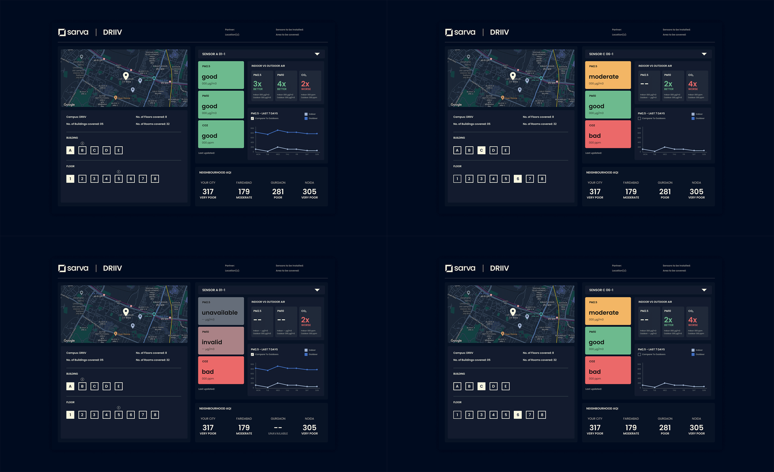
After the discussions, I defined the information would be the most useful and how it could be best represented. I ended up with the following 6 information blocks:
1. Project Context and Summary
2. Location and sites under project
3. Comparison of indoor air quality with the outdoors
4. Real-time readings of each sensor installed
5. Readings from a sensor over the past week
6. Data regarding air quality in the neighbourhood
INITIAL WIREFRAMES
Making data as simple and as understandable as possible.

During the initial wireframing phase, I explored layouts to effectively display required information and statistics, emphasizing clear communication of vital project information to partners. The wireframes were then shared with the stakeholders for feedback.
FEEDBACK
The feedback helped establish the hierarchy of information needed, and refine the designs based on the following points:
Sensor readings need to be prioritized.
Map can be used to choose location to view details
Displaying readings for all rooms may cause unnecessary confusion
MULTIPLE ROUNDS OF ITERATIONS
Compact, clear layout

Based on feedback, I eliminated tabs for streamlined access to all information in a single view, designing a few compact and clear layout alternatives.
Streamlining information to eliminate redundancy and repetition

I merged two sections: one displayed PM2.5 readings for the past week, and the other compared indoor PM2.5 with outdoor levels, which was partly repetitive. Now, a single section presents past week PM2.5 data as a default, with an option to toggle and view outdoor comparison.
Finding the best way to represent data clearly

I experimented with several different visualizations to discover the most accurate way to present data. My focus was establishing clear hierarchy to effectively convey the most important information first.
Intuitive navigation for sensor information
-
The map displays all locations covered under the project. Users choose location to view details. Selection triggers building and floor options.
-
Users select a building and a floor to view all the sensors placed at that location.
-
Dropdown displays sensors on selected floor. User picks a sensor for detailed view.

VISUAL DESIGN
Establishing a visual design system for consistency

I developed a design system based on Material Design principles, but adapted it to suit particular project needs. I established different containment areas to group and separate information throughout the dashboard.
COMPONENTS

FINAL DESIGN


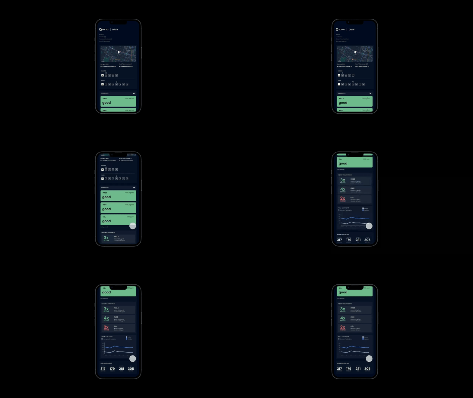
MOBILE VERSION

LEARNINGS AND REFLECTION:
Clarity drives success
The success of a dashboard depends on understanding the topic well. It is crucial to invest time g.5etting domain knowledge, to have clarity and to establish logical foundations. It was really helpful to have early stakeholder discussions and ongoing feedback.
Function comes first
A dashboard's main goal is to convey information effectively, prioritizing functionality over aesthetics. We should be mindful to avoid the inclusion of overly complex visualizations or redundant data solely for visual appeal. The key consideration should be whether the elements are necessary and important.

